Ad Disclosure
Thanks, Maryland: Let’s update the Big Ten primary helmet rankings
By Alex Hickey
Published:
In the most consequential college football news to break Monday, Maryland elected to dress itself respectably on the football field.
Given some of the things the Terps have worn over the years, it’s a welcome change.
Not just respectable. Pretty dang sharp, actually.
The Terrapins are returning to their classic “script Terps” helmets as their primary lids after using them as an alternate the past few seasons. The throwbacks were so popular among Maryland fans — and anyone with a working set of eyeballs, really — that the change was inevitable.
It's Iconic. It's Back.
Script Terps is now our full time uniform!
— Maryland Football (@TerpsFootball) April 17, 2023
And now that Maryland officially has a new helmet, we can jump straight into the business of ranking Big Ten football helmets.
We most recently did this with the top 10 alternate helmets in the B1G, which included the script Terps. For this exercise, we will focus solely on each team’s primary helmet.
And before we get started, remember that this website is called Saturday Tradition. Old-school looks curry favor with us.
1. Michigan
Often imitated, never duplicated.
Even if Princeton technically invented the winged helmet first, Michigan does it better. Maize and blue is easier on the eyes than Princeton’s orange and black helmets, which give the appearance of Halloween candy.
This is among the handful of helmets that people around the world can recognize even if they barely follow football.
⏳ Almost that time#GoBlue pic.twitter.com/sBIEv7cRHw
— Michigan Football (@UMichFootball) April 1, 2023
2. Ohio State
Speaking of never duplicated …
There is no helmet sticker like the Buckeye sticker. Like the Constitution, an Ohio State football helmet is a breathing document. Everybody starts with a clean slate, but by the end of the season you know who the Boss Buckeyes are.
Even on Michigan’s helmets, too many stickers can detract from the standalone brilliance of the winged helmet. But with Ohio State’s plain silver helmets, they add something. Everything, really.
Since 2020, the Ohio State WR room has included:
– Jameson Williams
– Chris Olave
– Garrett Wilson
– Jaxon Smith-Njigba
– Marvin Harrison Jr.CRAZY talent 😳 pic.twitter.com/TAPNPpZPky
— BetMGM 🦁 (@BetMGM) November 19, 2022
3. Penn State
Penn State’s helmets put some people to sleep. I am not among those people. The plain white helmets with the single black stripe are iconic and clean, especially when paired with the Nittany Lions’ road whites.
Nick Singleton has 5 runs of 40+ yards this season.
That's the most by a Penn State player since @saquon had 6 in 2017. 😲#B1Gstats pic.twitter.com/nxRWrnNGnE
— Penn State On BTN (@PennStateOnBTN) September 17, 2022
4. Iowa
The Hawkeyes wore a variety of different helmets in the 1960s and ’70s until Hayden Fry gave the program its trademark image in 1979. Looking to match a distinctive logo with the Pittsburgh Steelers’ color scheme, Fry found an artist who drew up the “Tigerhawk.”
It’s been on Iowa’s helmets ever since, and has become the logo of the entire athletic department. The ANF (America Needs Farmers) decals are also a nice touch.
The #BallHawks are cookin' 👨🍳@cdejean23 x #Hawkeyes pic.twitter.com/tyGqHPPlWJ
— Hawkeye Football (@HawkeyeFootball) December 31, 2022
5. Wisconsin
When Barry Alvarez arrived in Madison, he stole a page from Hayden Fry’s book. Wisconsin was a moribund program in need of a rebrand.
Wisconsin transitioned from a plain red “W” on a white helmet to “The Motion W.” The Badgers reached the Rose Bowl in their 3rd year wearing the Motion W, and now the look has been adopted by countless high schools around the country.
Thursday in the trenches 🍽 pic.twitter.com/nNwqhcvY93
— Wisconsin Football (@BadgerFootball) April 7, 2023
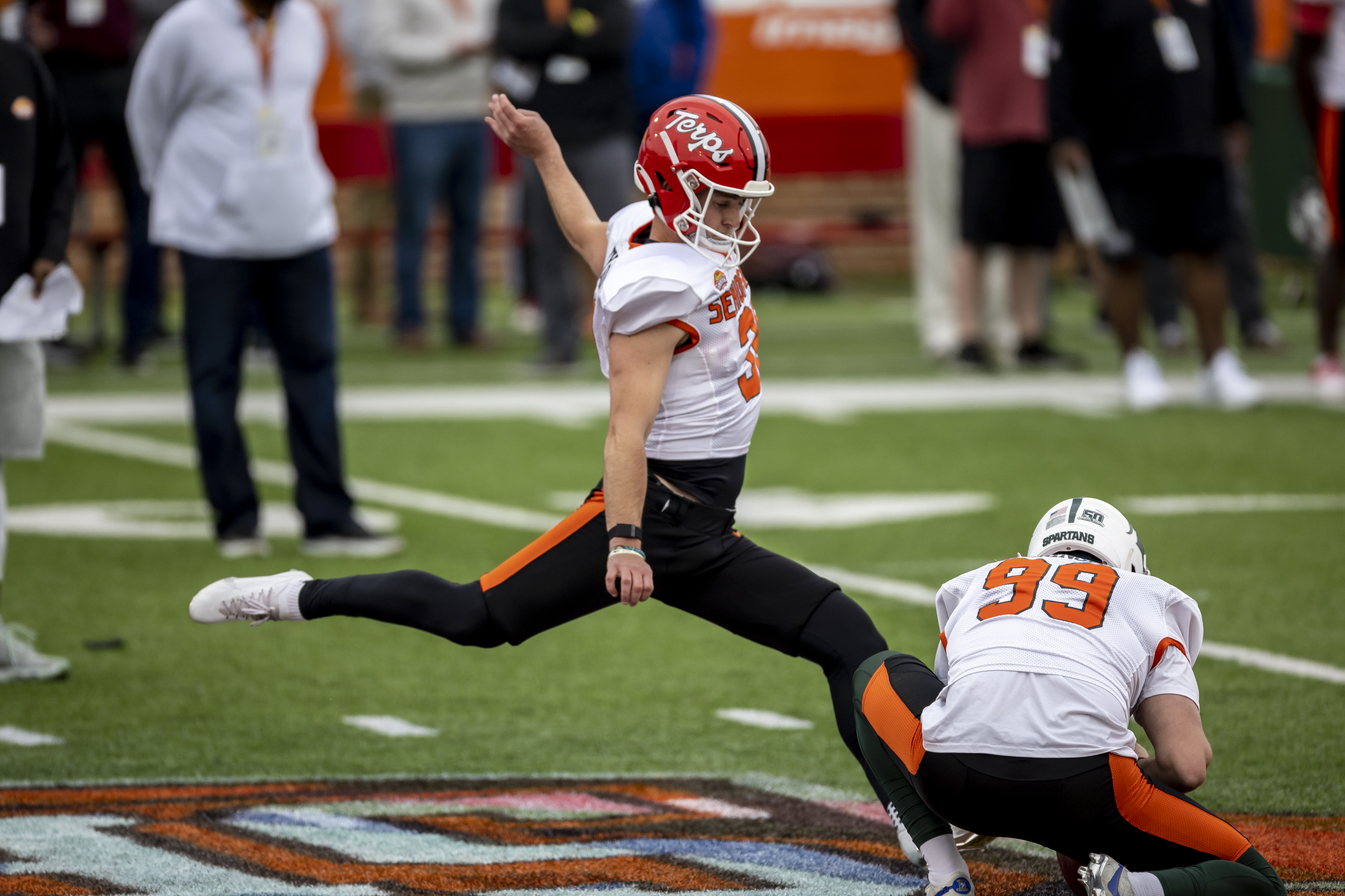
6. Maryland
Started from the bottom, now they’re here.
For more than a decade now, Maryland’s helmets have paid homage to the ugliest state flag in the union. And though it’s likely we’ll still see the flag saluted in an alternate form — Marylanders love that thing like crab cakes — this is a much-welcomed return to the Terps 1980s style.
7. Michigan State
The Spartans have fiddled with several designs over the years, and that continues to this day with an array of alternate helmets.
But the current primary, with a white Spartan outline on a matte green helmet with a single white stripe down the middle, is their best look.
𝐖𝐞𝐞𝐤 𝟑'𝐬 𝐂𝐨-𝐎𝐟𝐟𝐞𝐧𝐬𝐢𝐯𝐞 𝐏𝐥𝐚𝐲𝐞𝐫 𝐨𝐟 𝐭𝐡𝐞 𝐖𝐞𝐞𝐤: Payton Thorne of @MSU_Football #B1GFootball | #RELENTLESS
🗞️ https://t.co/YypmGW8nPk pic.twitter.com/nYFc8im35M
— Big Ten Football (@B1Gfootball) September 20, 2021
8. Nebraska
Given my reverence for classic looks, it may be a surprise to see Nebraska’s helmets ranked this low. And I readily admit my reason for doing so is probably silly. But I cannot ignore it.
It’s always bothered me that the “N” on Nebraska’s helmets does not match the “N” used as Nebraska’s primary logo. Why does the 50-yard line have a different “N” than the helmet?
These are the things that keep me awake at night.
NU v NU
who’s ready to see this in person? pic.twitter.com/00DVN7NpNV
— Nebraska Football (@HuskerFootball) April 15, 2023
9. Northwestern
All that said about Nebraska’s helmets, there’s a pretty clear demarcation between the Cornhuskers and the 6 teams below them on this list. There’s a clear top 8 of Big Ten helmets, and then there’s the rest. I wouldn’t argue against any order from 9-14 now that Maryland has upgraded.
But in terms of my personal tastes, I have always enjoyed Northwestern’s stylized white “N” on purple helmets. Nobody else has an “N” quite like Northwestern’s.
Rise Up.#GoCats pic.twitter.com/QPSSl3O8Ik
— Northwestern Football (@NUFBFamily) April 5, 2023
10. Purdue
Purdue’s primary helmets are pretty much unchanged from the Drew Brees Era, and they are perfectly fine. But they get docked a little in my eyes because the Boilermakers have a number of alternate helmets that are much, much cooler.
For instance, Purdue’s special Rose Bowl helmet was as good as it gets — though obviously that look has to be earned.
The black railroad track helmet is a distinctly awesome look, as is the Purdue Pete helmet the Boilers wore for the first time last season.
Please let Purdue DE George Karlaftis slide right down to the #Browns at #44. pic.twitter.com/24RMraLLTp
— Tyler Johnson (@T_johnson_TJ) March 29, 2022
11. Illinois
I know there are many who disagree, but the Block-I helmet is a major upgrade from the old underlined “Illinois” helmets that mimicked the 1980s New York Giants look. Those did nothing for me.
Attacked the day.#Illini // #HTTO // #famILLy pic.twitter.com/pGxXu8zewg
— Illinois Football (@IlliniFootball) April 12, 2023
12. Minnesota
Minnesota’s primary helmets are in the same class as Purdue’s — they’re fine, but the alternates are much cooler. The chrome and Goldy Gopher helmets are top-notch.
But the primary helmet almost feels like someone might have been trying to design a new Washington Commanders helmet and accidentally placed the “W” upside down.
The @AP is the latest to tag @jmschmitz1999 and @_MoIbrahim with All-American honors!
📰: https://t.co/TcjjOkFnsj pic.twitter.com/I4wswVM3Bk
— Minnesota Football (@GopherFootball) December 12, 2022
13. Indiana
In a recurring theme, the Hoosiers have a number of alternate helmets that are cooler than their primary look. If it was a matter of rating alternate helmets alone, Indiana and Minnesota would be near the top of the list.
However, the Hoosiers did upgrade their primary look last year by incorporating an element of their throwback helmets — a white center stripe with a black outline.
A subtle change, but a good one.
Deep in the find-the-right-guy process.
— Indiana Football (@IndianaFootball) April 15, 2023
14. Rutgers
If you’ve seen some of the things the Scarlet Knights have worn in the past, you’ll appreciate what an upgrade their perfectly average Block-R helmets are. These are only in last place because of Maryland’s dramatic upgrade — and somebody has to come in last.
To me, they are boring. But boring beats the heck out of ugly.
Isiah Pacheco was a highly under-appreciated running back prospect last year.⁰
Despite his fantastic career at @RFootball , impressive performances during the #ShrineBowl week of practice, and a 4.37 forty at the NFL Combine, Pacheco was selected in the 7th round, where the… pic.twitter.com/BgGurt4G9H— East-West Shrine Bowl (@ShrineBowl) April 5, 2023

Alex Hickey is an award-winning writer who has watched Big Ten sports since it was a numerically accurate description of league membership. Alex has covered college football and basketball since 2008, with stops on the McNeese State, LSU and West Virginia beats before being hired as Saturday Tradition's Big Ten columnist in 2021. He is an Illinois native and 2004 Indiana University graduate.